Data Analysis on unforgettable.me: Plotting
Prerequisites:
Data Analysis on unforgettable.me: Getting Started and Descriptive Statistics
Data Analysis on unforgettable.me: Preprocessing Your Data
In the previous tutorials, we discussed how to navigate to projects, to generate descriptive statistics and how to preprocess the data in preparation for analysis. In this tutorial, we will describe how to plot data for visualization.
To demonstrate the plotting capabilities of unforgettable.me, we will be using Demo Project (Event Segmentation V2), so if you wish to follow along navigate to the project and create a plot by clicking on the Plot button:
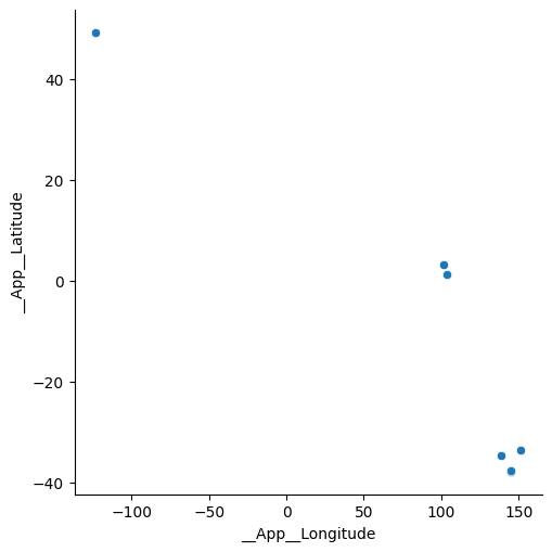
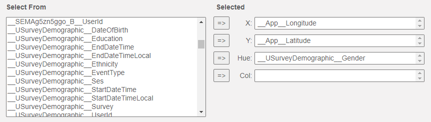
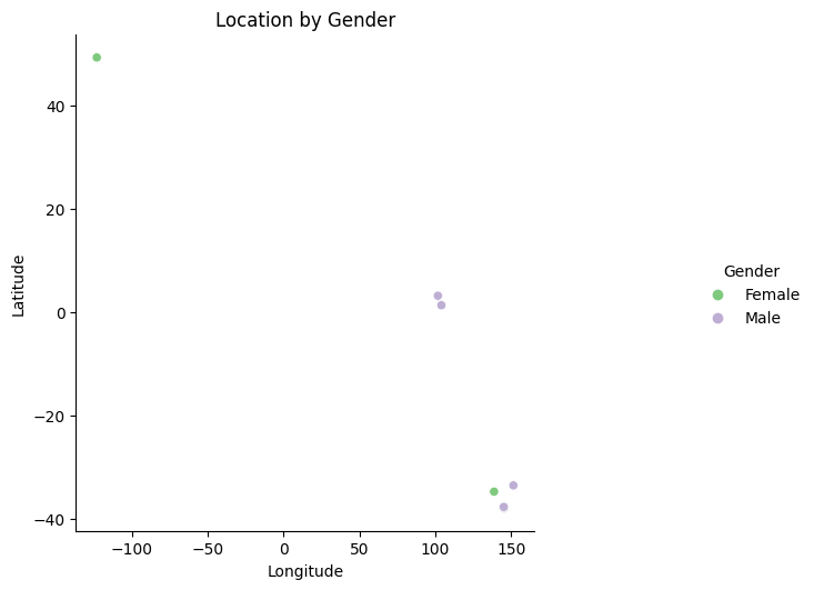
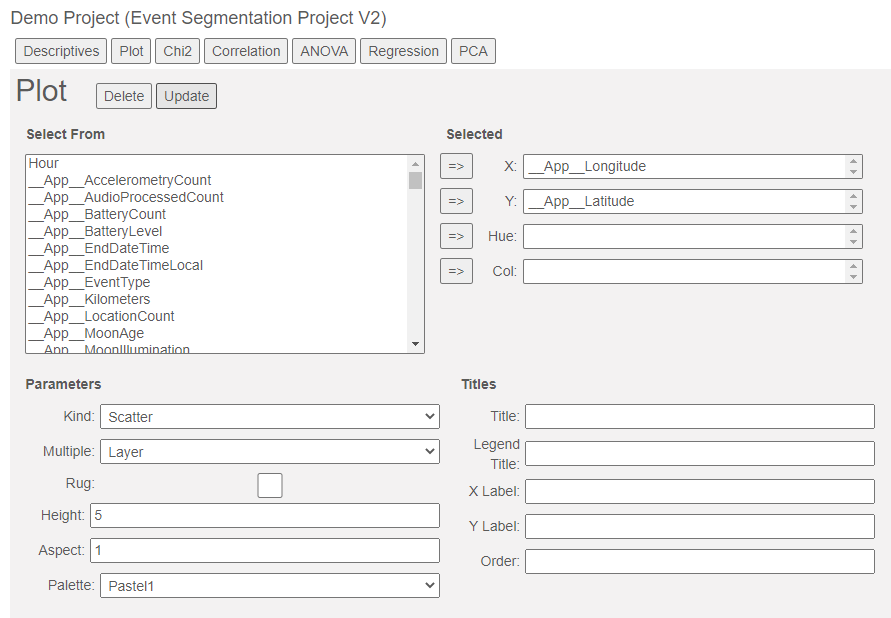
As in the other analyses, you can select variables from the Select From list to use in your plot. We start with a scatter plot of __App__Longitude and __App__Latitude. Click Update to generate the scatter plot:
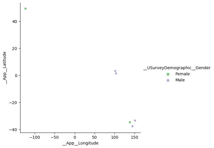
We can differentiate points on another variable by adding it to the Hue selection. For instance, to see how the sample divides by gender we can add __USurveyDemographics:
gives:
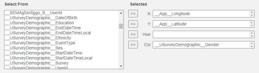
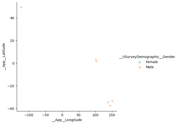
If we wish to create separate plots to differentiate the points by our third variable we can add _USurveyDemographics__Gender to the Col selector instead of the Hue selector:
gives:
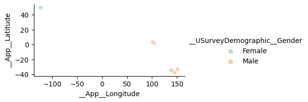
We can add titles by filling in Title, Legend Title, X Label and Y Label:
and change the colours used by changing the palette (this is Pastel 2):
We can also change the size and aspect ratio of the plot (size = 2, aspect ratio = 2):
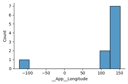
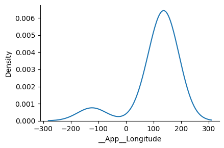
One can use the Kind selector to generate different types of plot. For instance, we can create a histogram of the longitudes by selecting Kind = Histogram and __App__Longitude for the X variable:
If we choose Kernel Density Estimator instead, we get a smoothed version of the histogram:
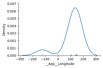
clicking on the Rug checkbox adds ticks to the axis:
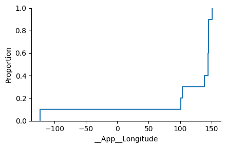
while the Empirical Cumulative Density Function plots the probability that the variable will be less than of equal a given value:
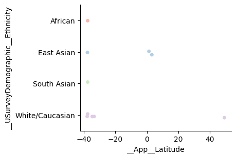
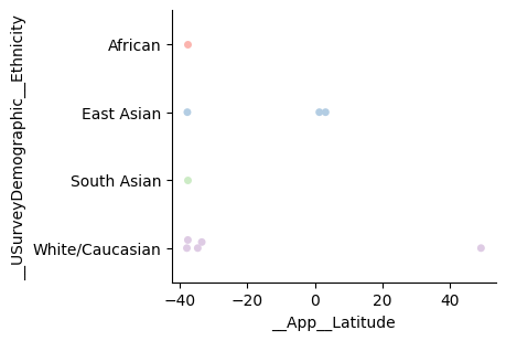
There are a number of plots that are appropriate when you need to plot numeric variables against categorical variables. In the following examples, we plot the longitude against ethnicity with Kind = Strip:
Kind = Swarm:
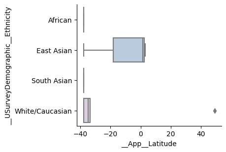
Kind = Box:
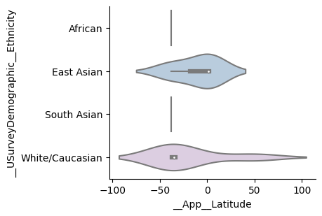
Kind = Violin:
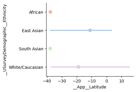
Kind = Point (with bars representing the 95% confidence intervals generated using bootstrap sampling):
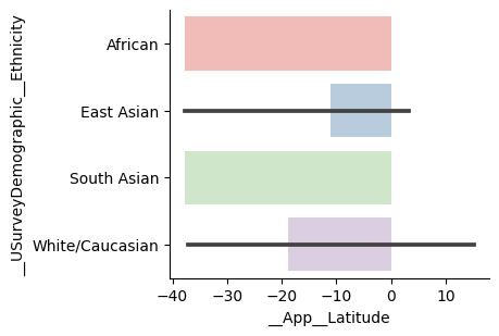
and Kind = Bar (again with 95% confidence intervals):
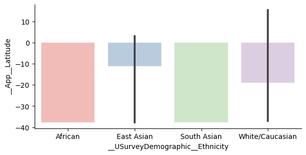
or switching the X and Y variables (if you prefer vertical bars):
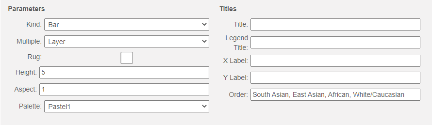
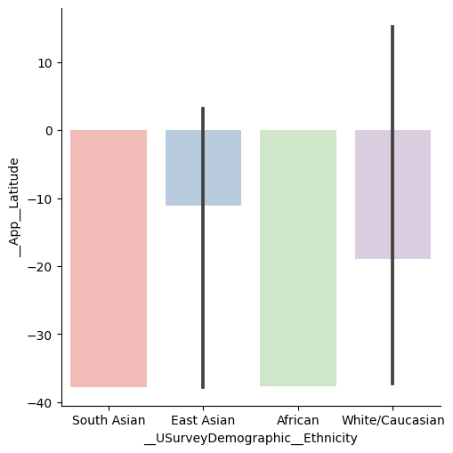
If you would like the categories to appear in a different order, you can use the order box as follows:
which produces the graph:
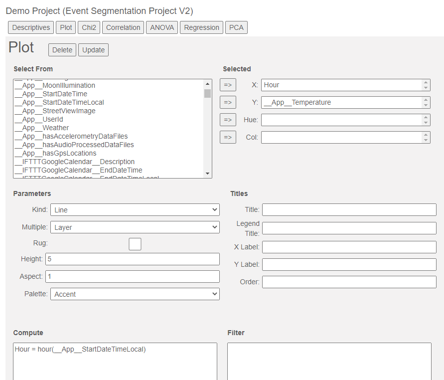
And finally, we have kind = Line which is suitable for plotting continuous variables against each other. For instance, if you wanted to see the temperature as a function of the hour of the day, you could use the hour function in the computer box as follows:
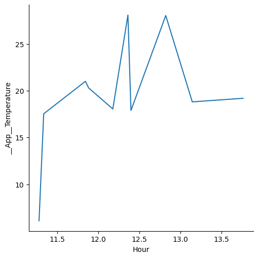
which would give the following plot:
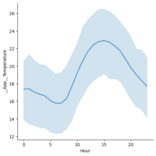
That might not be what you were expecting. During the aggregation phase both the temperature and the hour were averaged because they are numeric variables. It is more likely that you want to see temperature as a function of the whole hours - so we need to turn hour into a categorical variable so that means will be calculated for each hour block:
Hour = categorical(hour(__App__StartDateTimeLocal))
Now you will see the following plot:
The blue area represents the 95% confidence intervals.
By combining different options in the plotting interface a broad range of plots can be constructed.